Showing posts with label Health. Show all posts

Tuesday, June 4, 2019

Alcohol-Related Maps

Here's an interesting collection of alcohol-related maps....


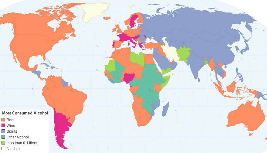
Most Consumed Alcoholic Beverage by Country


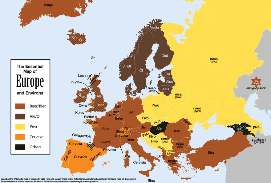
Beer Names in Different European Languages

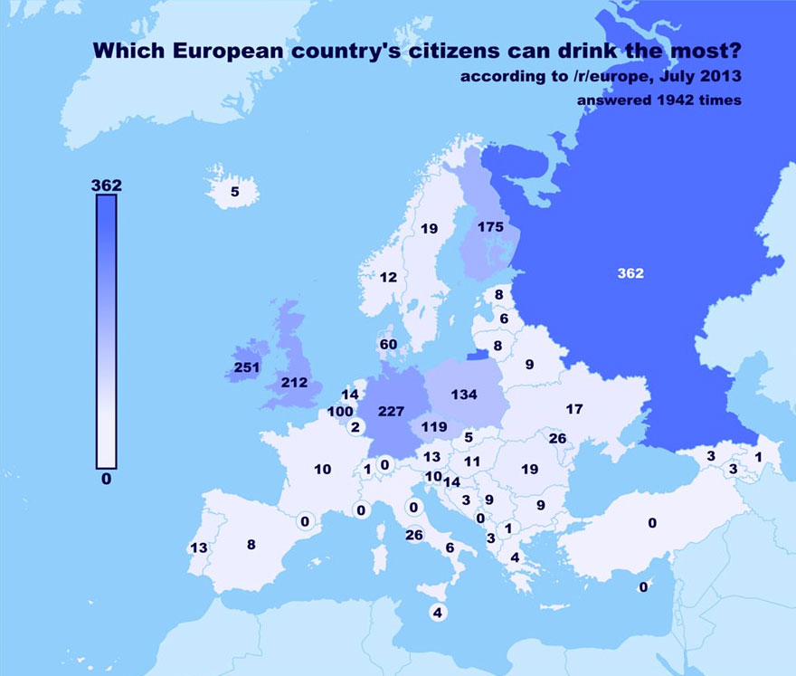
European Citizens Who Drink the Most

The Countries That Drink The Most - Business Insider


Alcohol Choice by State According to Twitter Users)

Further Info

Legal drinking age

Tuesday, July 29, 2014

The Health Benefits of Trees

Air Pollution Removal by Trees
 

It is becoming increasingly clear that trees help people live longer, healthier, happier lives—to the tune of $6.8 billion in averted health costs annually in the U.S., according to research published this week. And we're only beginning to understand the nature and magnitude of their tree-benevolence.

Article >


Monday, March 10, 2014

Peak Seasonal Ingredient Map

Nice interactive map shows what's fresh in your area (plus find ingredient descriptions, shopping guides, recipes, and tips)

View Interactive Map >

Wednesday, January 8, 2014

Life Expectancies Infographic


Charting the Life Expectancies of the World's Countries


(with link to magnifiable infographic)

Based on data from CIA's World Factbook and the Encyclopedia Britannica. 
A fascinating study and stunning visual summation.

Thursday, September 5, 2013

The Measure of America - Interactive Map


The Measure of America 2013–2014

"In the era of “big data,” it would seem that policymakers and regular people alike would have the information they need at their fingertips to understand their world and make it better. Unfortunately, that’s far from the case. Though we know the country’s gross domestic product quarterly, its retail sales monthly, and stock market numbers minute-by-minute, we rarely hear statistics on our country’s people.
How long can a baby born today in Missouri, New Mexico, or Minnesota expect to live? What proportion of adults have completed high school in Houston as compared to Dallas? What wages and salaries are typical of Latinos in the United States, and how do they compare to those of whites or African Americans?"
Measure of America
- A Project of the Social Science Research Council


The Measure of America 2013–2014

Chock full of infographics and interactive maps, this site is a project of the Social Science Research Council. Its mission is to use data points to measure American's well-being and access to opportunity. The third volume in the Measure of America series measures well-being in three vital areas—health, education, and earnings.

Interactive Map

Ever wondered how your state or congressional district stacks up compared with your neighbors on life expectancy, preschool enrollment, earnings or dozens of other indicators?  Create customized maps >


Wednesday, August 7, 2013

The Happiest States In America?

Based on results from a study of geotagged tweets published earlier this year

Thursday, April 11, 2013