Showing posts with label World Map. Show all posts

Saturday, June 25, 2022

Map Quizzes

Geography Games - Seterra Geography  Quizzes

This is a great site - there are a large assortment of map quizzes to choose from. Some are easy, some are fairly difficult! Highly recommended...


Map Quizzes >


Tuesday, March 15, 2022

Early Human Migration

Fascinating data visualizations of our migratory ancestry as humans ...

How did our species become the last surviving hominin on the planet?

Max Planck Institute and the University of Michigan

Article >

27 million people linked in largest-ever family tree

Researchers at the University of Oxford’s Big Data Institute have created the largest-ever family tree, which links more than 27 million people — both living and long dead — across the world.

Article >

Thursday, February 3, 2022

How Earth Would Look If All The Ice Melted

There's a very powerful video on YouTube illustrating
"How Earth Would Look If All The Ice Melted"

YouTube Video >

Highly recommended! - Below are a few screenshots...

India and Bangladesh
The west coast of Africa
China
U.S.A. Southeast
Australia


Monday, April 12, 2021

The World's Most Spoken Languages

The 100 Most Spoken Languages Around the World

Around the world, there are more than 7,000 regularly spoken vernaculars, this infographic shows off the top 100 most common languages in a very nice linguistic infographic. World languages list varied origins, with some branching off from the same ancient roots and some having a history all their own. 

The myriad of languages have been illustrated with its language origin tree, so you can easily trace their roots. Beautiful and ever-evolving, like a forest, the sheer variety of common languages spoken around the globe has been charted here in one world language map. Check out the top 100 most popular languages and their origin.

Check out Infographic >


The 10 Most Spoken Languages In The World

Almost half of the world’s population claims one of only 10 languages as their mother tongue

Please note:
What constitutes a language or a dialect is hotly contested stuff. More troubling is the fact that what we refer to simply as “Chinese” is actually a whole family of languages conveniently lumped into a single category. “Hindi” is also used as a catchall term to cover numerous dialects and sub-dialects.


Top 10 Languages By Number Of Native Speakers:
1. Chinese — 1.3 Billion Native Speakers
2. Spanish — 460 Million Native Speakers
3. English — 379 Million Native Speakers
4. Hindi — 341 Million Native Speakers
5. Arabic — 315 Million Native Speakers
6. Bengali — 228 Million Native Speakers
7. Portuguese — 220 Million Native Speakers
8. Russian — 153 Million Native Speakers
9. Japanese — 128 Million Native Speakers
10. Lahnda (Western Punjabi) — 118 Million Native Speakers

Saturday, December 12, 2020

Three Great Interactive Maps

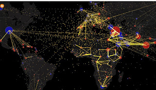
A Few Great Interactive Maps...

With technology advancements, content on maps and the maps themselves became digital, interactive, and more appealing as they’re incorporated in data analysis and reporting. Seeing location data mapped and included in visualizations has both enhanced understanding by more audiences and offered a valuable, new context.

Below are three notable data-driven examples that demonstrate the power of location data when paired with business intelligence.

1 - The invisible heartbeat of New York City

Visualization by: Justin Fung. This is amazing (you may have to refresh the page)

http://manpopex.us/


2 - All the World’s Immigration Visualized in One Map

Estimated net immigration (inflows minus outflows) by origin and destination country between 2010 and 2015.


 3 - Mapping America’s Futures

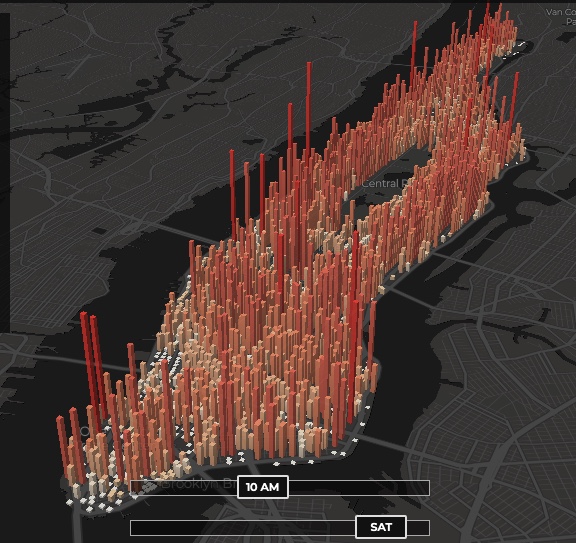
This is a great example of a well made data-driven interactive map.

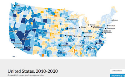
Test possible scenarios for how the US population might change by 2020 and 2030. The results will change depending on whether you choose low, average, or high rates for future births, deaths, or migration.

https://apps.urban.org/features/mapping-americas-futures/#map


Friday, December 11, 2020

Maps That Show Us A New Perspective

This is an interesting site! The blurbs with each map are short and well written as well....

Land Use Throughout The United States

Air Traffic Control Zones Look Nothing Like The Country

Metric System Vs. Imperial System

Texas Doesn't Look All That Big Next Compared To Africa

Maps That Show Us A New Perspective >


Saturday, December 5, 2020

Ghost Towns of the World

This a phenomenal site! Navigate across the world using a Google Map that links to a myriad of wb sites on ghost towns, etc.
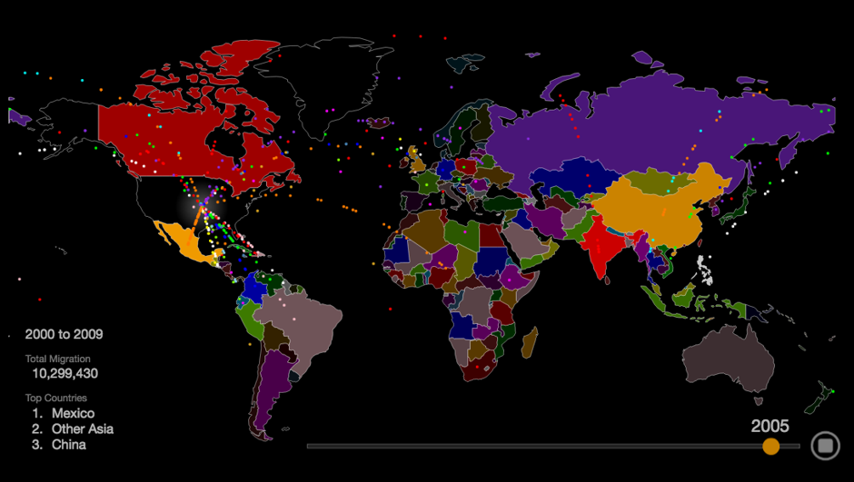
Ghost Towns of the World


Map location links will take you to sites with photos such as these:

Tuesday, June 4, 2019

Alcohol-Related Maps

Here's an interesting collection of alcohol-related maps....


Most Consumed Alcoholic Beverage by Country


Beer Names in Different European Languages


European Citizens Who Drink the Most


The Countries That Drink The Most - Business Insider


Alcohol Choice by State According to Twitter Users)

Further Info

Legal drinking age

Wednesday, December 16, 2015

World History (Empires) - YouTube Gems

Five Great History Animations worthy of special mention.  Four of these listed below feature maps that expand and collapse thru time. The fifth animation uses an “empire sized by circle” approach in which bubbles grow and pop off "children” - Very unusual but the in-depth attention to historical detail is amazing.

Top 10 Largest Empires


Very informative

History Of The Empires

^ Actually just focused on the Mediterranean and Middle East Regions but still informative

The History of the World's Civilizations in 2 Minutes


History of Europe - 6013 years in 3 minutes


Monday, December 14, 2015

World Religions - YouTube Gems

Interactive maps are great but sometimes a short video can present the info in a more compelling way. YouTube is chock full of crap but there are gems aplenty as well.

History of Religions

Timeline on bottom is a nice touch

How Religion Spread Around the World

^ Fantastic!

1300 Years of Islamic History in 3 Minutes


^ Very Nicely Done

Friday, December 4, 2015

Mapping International and Domestic Terrorism

Terrorism and sabotage seems to occur on an almost daily basis across the world with ever increasing frequency. Terrorist attacks are now sadly part of our contemporary landscape and regarded as a foreseeable yet analyzable business risk.

U.S. Terror History Map

The Investigative Project on Terrorism


Active Global Terrorist Organizations


Map of Islamic Terrorism


Mapping Militant Organizations

Stanford University - The Mapping Militants Project identifies patterns in the evolution of militant organizations in specified conflict areas and seeks to discover the causes and consequences of their evolution.


The plague of global terrorism

The number of deaths from terrorism nearly doubled in 2014


Saturday, September 12, 2015

State of the World (Myriad Editions)

I took this book/atlas out of the library near where I work. Highly recommended, it is very nicely done...

The State of the World Atlas, was originally devised by Michael Kidron and Ronald Segal and is now authored by leading international peace researcher Dan Smith, OBE. It has sold more than 700,000 copies worldwide.  (Myriad Editions-  Penguin Books)

Over 50-plus thematic world maps and vivid graphics break down hardcore statistics into an accessible, compelling form. A unique visual overview of current events and global trends.
Atlas Book Cover


EXAMPLES


As used in blogs...


Friday, September 11, 2015

Mapping Stereotypes by Yanko Tsvetkov

I was actually out to compile a different set of (serious!) maps but Yanko's work caught my eye and this post came about instead - he is brilliant!

Atlas of Prejudice

Visit his gallery: https://atlasofprejudice.com/


Be sure to visit his site for more "mapped insights" on stereotypes

Mapping Stereotypes >

Infographics Blog Feature:


Monday, March 2, 2015

OpenStreetMap - A Decade of Growth

Watch a Decade of Data Come to Life on OpenStreetMap

Using GPS tools, satellite photographs, and their own local knowledge, citizen cartographers the world over have used the open-source platform to map the world little by little. From this, Mapbox has created a remarkable interactive that shows crowd-sourced geographic data “coming to life” across the globe…

Article >


Monday, December 15, 2014

Geostrategy - Worldwide American Military Presence


The Big Mystery…
The U.S.A. is deployed in over 135 countries worldwide. There are more than 1,000 U.S. military bases dotting the globe. Nobody knows the exact number for sure - being strategic and due to the instability in the world much is kept secret...

Mega Bases
Former Yugoslavia, Iran, Afghanistan are a few of the countries with American Mega-Bases with the usual assortment of Burger Kings and Popeyes, basically  transplanted  nothing U.S. town on foreign soil, bustling in a way increasingly rare for actual American towns these days, part of a planetary military deployment of a sort never before seen in history.  The staggering size, scope, and strangeness of all this is seldom considered, analyzed, or debated in the American mainstream.
http://www.tomdispatch.com/blog/175338/


Historical Maps of U.S. Expansion


Link to Maps...


Middle East Geostrategy


Petroleum and International Theatre of War 
in the Middle East


Worldwide Presence

Interactive Map of U.S. Army Bases

Article
See the world’s foreign military bases from outer space 
Article (Google Earth)

U.S. Military Bases >

Great Google Based map that shows everything
(1) Go to Home and Pan on map or 
(2) Go the regional links


Friday, November 7, 2014

Tracking the Rise of Globalization...

International Phone Calls


Tracking International Phone Calls is one way of measuring how information flows around the world
Developed by business researchers and sponsored by shipper DHL, this map shows the volume of phone calls between countries around the world.

Article and Map >