Showing posts with label Data Visualization. Show all posts

Tuesday, March 15, 2022

Early Human Migration

Fascinating data visualizations of our migratory ancestry as humans ...

How did our species become the last surviving hominin on the planet?

Max Planck Institute and the University of Michigan

Article >

27 million people linked in largest-ever family tree

Researchers at the University of Oxford’s Big Data Institute have created the largest-ever family tree, which links more than 27 million people — both living and long dead — across the world.

Article >

Tuesday, February 15, 2022

Where angry waters roll (1936 US Flood Map)

Where angry waters roll (1936 US Flood Map)

Fascinating data visualization of flood prone areas across the United States from the David Rumsey Collection 


Interactive Map >
(zoom and pan)


Friday, February 4, 2022

The Tallest Lifeforms (Video)

These are screenshots from a wonderful video: "The Tallest Lifeforms Of All Time". Great use of analytic visual comparisons...

Watch Video >

Wednesday, January 5, 2022

What's the Golden Rule and the Green Rule?

 What's the Golden Rule?

The Golden Rule is the principle of treating others as one wants to be treated. It is a maxim that is found in most religions and cultures

The Golden Rule is the principle of treating others as one wants to be treated. It is a maxim that is found in most religions and cultures

The idea dates at least to the early Confucian times (551–479 BCE), appearing prominently in Buddhism, Christianity, Hinduism, Islam, Judaism, Taoism, Zoroastrianism, and "the rest of the world's major religions".


What's the Green Rule?

The Green Rule is derived from the classic Golden Rule found in major faith traditions, paraphrasing it by saying: "Do unto the Earth as you would have it do unto you."

Selected from many of the world’s great religious texts and spiritual teachings, the Green Rules were chosen to demonstrate that each religion and spiritual philosophy has a long-standing tradition of ecological stewardship...


Religions

Animated map showing how religion spread around the world
(YouTube  / Business Insider)

Monday, April 12, 2021

The World's Most Spoken Languages

The 100 Most Spoken Languages Around the World

Around the world, there are more than 7,000 regularly spoken vernaculars, this infographic shows off the top 100 most common languages in a very nice linguistic infographic. World languages list varied origins, with some branching off from the same ancient roots and some having a history all their own. 

The myriad of languages have been illustrated with its language origin tree, so you can easily trace their roots. Beautiful and ever-evolving, like a forest, the sheer variety of common languages spoken around the globe has been charted here in one world language map. Check out the top 100 most popular languages and their origin.

Check out Infographic >


The 10 Most Spoken Languages In The World

Almost half of the world’s population claims one of only 10 languages as their mother tongue

Please note:
What constitutes a language or a dialect is hotly contested stuff. More troubling is the fact that what we refer to simply as “Chinese” is actually a whole family of languages conveniently lumped into a single category. “Hindi” is also used as a catchall term to cover numerous dialects and sub-dialects.


Top 10 Languages By Number Of Native Speakers:
1. Chinese — 1.3 Billion Native Speakers
2. Spanish — 460 Million Native Speakers
3. English — 379 Million Native Speakers
4. Hindi — 341 Million Native Speakers
5. Arabic — 315 Million Native Speakers
6. Bengali — 228 Million Native Speakers
7. Portuguese — 220 Million Native Speakers
8. Russian — 153 Million Native Speakers
9. Japanese — 128 Million Native Speakers
10. Lahnda (Western Punjabi) — 118 Million Native Speakers

Monday, January 18, 2021

Two fabulous interactive data visualizations

A couple of really well done interactive data visualizations...

1 - Galaxy of Covers

How can music and a love of interplanetary ideas mix together to make a data visualization? With this lovely interactive example of a data analysis about famous song covers. Each song is a planet and its covers are satellites orbiting around it. Each song planet can be clicked on to visualize its own specific data. 

Songs...

  • Walk On By
  • All Along The Watchtower
  • Hallelujah
  • With A Little Help From My Friends
  • etc.

Scroll down and interact - amazing

Go to Interactive Visual >


2- 200 Years of Immigration to the U.S

This is beautiful! Hover over any color at any point, and see the exact number of immigrants who became residents from that country in a specific decade. 

Wednesday, January 13, 2021

Rock Band Timelines

Wikipedia is always a great resource for info. From obscure history details to well written summations of art, literature and music its no wonder Google Searches always turn up a Wikipedia page first!

The visual format of the revolving membership in rock bands is a great example of well done data visualization. Below are a few from the collection. Click any graphic to see its enlargement

Allman Brothers

Eagles

FleetwoodMac

Genesis

Frank Zappa and the Mothers of Invention

Pink Floyd

Rufus

The Band

Traffic

v
x

Best Data Visualizations of 2020

 A few selections from the visme site...

Plastic Bottles

Humans are addicted to drinking water from plastic bottles. This has turned into a huge garbage problem. This visualization shows the piles of plastic bottles in relation to famous landmarks and cityscapes. Source #5


Space Junk

Data artist Federica Fragapane was commissioned by the BBC to create a data visualization about Space Junk. The data sets are separated into different categories; the distance from the earth, the types of space junk, and the size and mass of the objects. Source #10


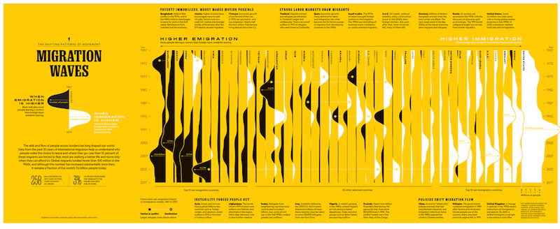
Migration


Migration waves is a visualization of data from 50 years of migration. The black and white waves over the yellow background create a wonderfully visual rendition of the data. It’s interesting to see in which countries more people leave and in which countries more people settle anew. Source  #21


Saturday, December 12, 2020

Three Great Interactive Maps

A Few Great Interactive Maps...

With technology advancements, content on maps and the maps themselves became digital, interactive, and more appealing as they’re incorporated in data analysis and reporting. Seeing location data mapped and included in visualizations has both enhanced understanding by more audiences and offered a valuable, new context.

Below are three notable data-driven examples that demonstrate the power of location data when paired with business intelligence.

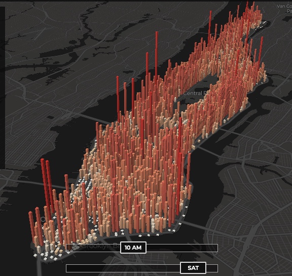
1 - The invisible heartbeat of New York City

Visualization by: Justin Fung. This is amazing (you may have to refresh the page)

http://manpopex.us/


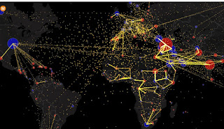
2 - All the World’s Immigration Visualized in One Map

Estimated net immigration (inflows minus outflows) by origin and destination country between 2010 and 2015.


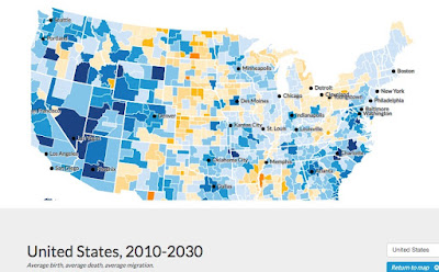
 3 - Mapping America’s Futures

This is a great example of a well made data-driven interactive map.

Test possible scenarios for how the US population might change by 2020 and 2030. The results will change depending on whether you choose low, average, or high rates for future births, deaths, or migration.

https://apps.urban.org/features/mapping-americas-futures/#map


Monday, December 18, 2017

Strava Heat Map

Strava is an app that tracks your activity with GPS (biking, running. skiing, etc.). On November 1, 2017 Strava unveiled a global heatmap of the most active exercise spots on the planet.
“A global community can seem very abstract until you see its activities visually represented in your immediate location and across the world.”
- Strava CEO James Quarles

Strava Interactive Heat Map

U.S.
Fairfield County, CT

Friday, July 24, 2015

Interactive "Music Infographics" from the Google Creative Lab

Alexander Chen - Google Creative Lab

This work is outstanding!!

Conductor turns the New York subway system into 
an interactive string instrument.


Les Paul Google Doodl

A tribute to Les Paul.

Pianophase.com -
A performance and visualization of the first section from 
Steve Reich's 1967 piece Piano Phase.

Visit:

http://www.chenalexander.com


Friday, June 26, 2015

When Maps Lie!

Tips from a geographer on how to avoid being fooled

Maps are big these days. Blogs and news sites frequently post maps and those maps often go viral… they’re all over Facebook, Twitter, and Tumblr, and news organizations are understandably capitalizing on the power that maps clearly have in digital space: they can visualize a lot of data quickly and effectively. But they can also visualize a lot of data inaccurately and misleadingly.

The way the data is distributed is important...

While all three maps use the exact same data, the different choices for classes in each map make the number of Hispanic people appear vastly different.
"Americans are taught from an early age to analyze and understand the meaning and manipulation of words, but they are rarely taught the same skills about maps."

Article >


Monday, June 15, 2015

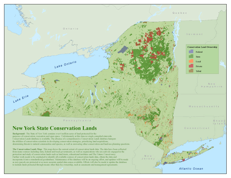
New York State Interactive Conservation Maps

New York State Lands Interactive Mapper

An internet mapping tool that allows users to discover recreational features such as roads, trails, and parking lots on Department of Environmental Conservation (DEC) owned lands, print maps, and obtain supported information on the use of state owned forest lands.
 

State Lands Interactive Mapper (SLIM) >


 New York Protected Areas Database (NYPAD)

 These lands cover over six million acres, approximately 20% of New York State.

Interactive Map >

Monday, March 2, 2015

OpenStreetMap - A Decade of Growth

Watch a Decade of Data Come to Life on OpenStreetMap

Using GPS tools, satellite photographs, and their own local knowledge, citizen cartographers the world over have used the open-source platform to map the world little by little. From this, Mapbox has created a remarkable interactive that shows crowd-sourced geographic data “coming to life” across the globe…

Article >


Monday, November 24, 2014

Hieronymus Bosch - Butt Music!

Hieronymus Bosch's painting "The Garden of Earthly Delights" - is a masterpiece and truly the work of a mad genius. Strange folks emerge from eggs, defecate flutes and seemingly contort in sinful delight across the three panels.


Well what the heck does that have to do with Infographics?!
One small figure has music written across their butt - truly one of the most unique data visualizations ever, but nevertheless it is an infographic!

But no that's not even the punch line - folks have actually arranged and recorded this composition - Hieronymus would have been proud to hear his butt piece performed!

Hieronymus Bosch Butt Music
https://www.youtube.com/watch?v=OnrICy3Bc2U

Chorale Version
http://www.discovery-zone.com/hidden-song-hell-secret-message-left-hieronymus-bosch/


Friday, November 14, 2014

Unfinished Suburbs of America

Burbs Going Bust

Jett, Megan. 30 Apr 2012. ArchDaily
Check Out the Full Infographic >


The Unfinished Suburbs of America

"zombie subdivision"


The Malling of America

(from landscape to crudscape...)


Site >


An interesting look at the forces tearing apart America's towns, cities, and farms and its impact on our lives. 
Photos, Presentations, References to Other Sites, Books, etc.


Do It Your Self Research

Google Search Terms:

death of suburbia 
zombie subdivision
New Urbanism
James Howard Kunstler
Geography Of Nowhere
The Long Emergency
Suburban Sprawl

Friday, November 7, 2014

Tracking the Rise of Globalization...

International Phone Calls


Tracking International Phone Calls is one way of measuring how information flows around the world
Developed by business researchers and sponsored by shipper DHL, this map shows the volume of phone calls between countries around the world.

Article and Map >