Showing posts with label Interactive Mapping Tool. Show all posts

Monday, June 15, 2015

New York State Interactive Conservation Maps

New York State Lands Interactive Mapper

An internet mapping tool that allows users to discover recreational features such as roads, trails, and parking lots on Department of Environmental Conservation (DEC) owned lands, print maps, and obtain supported information on the use of state owned forest lands.
 

State Lands Interactive Mapper (SLIM) >


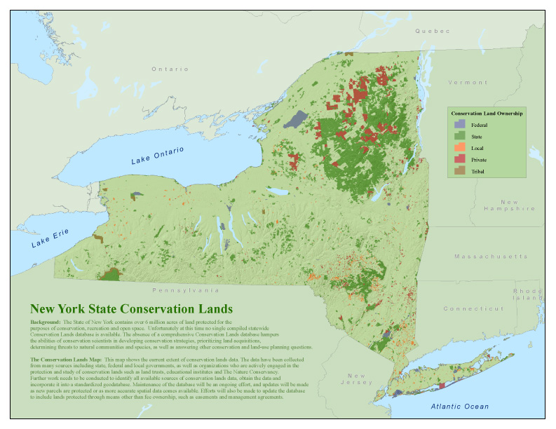
 New York Protected Areas Database (NYPAD)

 These lands cover over six million acres, approximately 20% of New York State.

Interactive Map >

Wednesday, December 11, 2013

The Open Accessible Space Information System (OASIS)


Develop a better understanding of the NYC environment with a robust data-driven interactive map. Search for and view open spaces, property information, transportation networks and more,  all in one place. 


Saturday, September 7, 2013

U.S. Language Mapper Tool


2011 Language Mapper Tool - U.S Census Bureau


This highly interactive map does a good job of showing 
where non-english languages prevail through out the U.S.A.


Map Visualizations are based on this data >

Thursday, September 5, 2013

The Measure of America - Interactive Map


The Measure of America 2013–2014

"In the era of “big data,” it would seem that policymakers and regular people alike would have the information they need at their fingertips to understand their world and make it better. Unfortunately, that’s far from the case. Though we know the country’s gross domestic product quarterly, its retail sales monthly, and stock market numbers minute-by-minute, we rarely hear statistics on our country’s people.
How long can a baby born today in Missouri, New Mexico, or Minnesota expect to live? What proportion of adults have completed high school in Houston as compared to Dallas? What wages and salaries are typical of Latinos in the United States, and how do they compare to those of whites or African Americans?"
Measure of America
- A Project of the Social Science Research Council


The Measure of America 2013–2014

Chock full of infographics and interactive maps, this site is a project of the Social Science Research Council. Its mission is to use data points to measure American's well-being and access to opportunity. The third volume in the Measure of America series measures well-being in three vital areas—health, education, and earnings.

Interactive Map

Ever wondered how your state or congressional district stacks up compared with your neighbors on life expectancy, preschool enrollment, earnings or dozens of other indicators?  Create customized maps >


Wednesday, May 8, 2013

The Housing + Transportation Affordability Index

This interactive map is amazing!

http://htaindex.cnt.org/map/
(A good sequel to yesterday's post...)

The Housing + Transportation Affordability Index is an innovative tool that measures the true affordability of housing based on its location.  Users can view housing and transportation data as maps, charts, and statistics for nearly 900 metropolitan and micropolitan areas—covering 89 percent of the U.S. population. 

The interactive mapping tool was designed to enable individuals, planners, and policymakers to more fully grasp and act on the relationship between development patterns, transportation behavior, and household transportation costs. 

Wednesday, March 27, 2013

Friday, March 15, 2013

If the Earth Were a Sandwich

Locate your position on one map and discover 
what's on the other side of the Earth on the other map. Try it!

The Antipode Map

This is really wild. Use the slider to fade out the second overlay 
and it will start to make sense. Very cool!


What's on the Other Side of the Earth?

Saturday, March 2, 2013

U.S. Passenger Rail Ridership


Interactive map featuring data on all Amtrak routes 


Amtrak Could Become Profitable...

Over the last 15 years, Amtrak ridership has grown 55 percent, outpacing population growth by a factor of three. It’s the fastest growing means of domestic transport, and shows no signs of slowing down. Article >

Tuesday, February 12, 2013

Lord of the Rings - Interactives


Timeline

Whether you are a fan or not of Lord of the Rings (I confess, I am a fan), this is an amazing interactive piece.  Smartly combining map locations a vertical timeline, this interactive timeline is extremely well designed and loads quickly whether by rollover or click.
Go to the site and check it out
http://lotrproject.com/timeline/


Map


The map also is a quick load and layers are easily displayed with a checkbox. Brilliant!
http://lotrproject.com/map/#zoom=3&lat=-1100&lon=1500&layers=BT