
Thursday, February 28, 2013
Tornados
What / Where is Tornado Alley?

A diagram of Tornado Alley's rough location (red), and its contributing weather systems
Monday, February 25, 2013


Sunday, February 24, 2013
If the World were 100 People...
An interesting challenge: If we could reduce the world's population to a village of precisely 100 people, with all existing human ratios remaining the same, how could you present the demographics if the most engaging way?


Brilliant work by Tony Ng
Click on each image for an enlargement
Stats
- The village would have 61 Asians, 13 Africans, 12 Europeans, 9 Latin Americans, and 5 from the USA and Canada
- 50 would be male, 50 would be female
- 75 would be non-white; 25 white
- 67 would be non-Christian; 33 would be Christian
- 80 would live in substandard housing
- 16 would be unable to read or write
- 50 would be malnourished and 1 dying of starvation
- 33 would be without access to a safe water supply
- 39 would lack access to improved sanitation
- 24 would not have any electricity (And of the 76 that do
- have electricity, most would only use it for light at night.)
- 8 people would have access to the Internet
- 1 would have a college education
- 1 would have HIV
- 2 would be near birth; 1 near death
- 5 would control 32% of the entire world's wealth; all 5 would be US citizens
- 48 would live on less than US$ 2 a day
- 20 would live on less than US$ 1 a day
Others
If the World were 100 People (floda31)
If the World were 100 People (Ferlazzo)
If the World were 100 People (DocStac)
Saturday, February 23, 2013
Clean Transportation? The Winner
Emissions from cycling are over 10 times lower than those stemming from the passenger car,"even taking into account the additional dietary intake of a cyclist compared with that of a motorized transport user." Bean eaters on bikes don't worry! :-)


Friday, February 22, 2013


Thursday, February 21, 2013

Tuesday, February 19, 2013
Odd Instruments Used in Popular Music
Strange Sounds... Odd Instruments Used in Popular Music
This is a wonderfully done pictorial series on unusual musical instruments. Clear illustrations and explanations pointing to various spots on each instruments bring the entire project to life!

This is a wonderfully done pictorial series on unusual musical instruments. Clear illustrations and explanations pointing to various spots on each instruments bring the entire project to life!
Whamola, Drumitar, Hurdy-Gurdy, Thermin. Mellotron and more
Monday, February 18, 2013
Life Satisfaction World Map
World Map showing "life satisfaction" in different nations.
Pity the poor Russians...

Sunday, February 17, 2013
Meteorites...
February 15, 2013
Chelyabinsk, Russia (about 930 miles east of Moscow)
With a blinding flash and a booming shock wave, the meteor blazed across western Siberia and exploded with the force of 30 atomic bombs, injuring more than 1,000 people as it blasted out windows and spread panic in a city of more than 1 million.

Video of Meteorite
Is Russia Marked For Meteors?

1908 Tunguska Event

Meteorite Map

Saturday, February 16, 2013
Animated Maps of Water Vapor (Cloud Cover, etc.)
The ability to see Earth from space has forever changed our view of the planet. Now able to look at the Earth as a whole,. we can observe how its atmosphere, oceans, landmasses, and life interact as global systems
Water Vapor (Monitoring Moisture Patterns)
Heat and moisture from the oceans drive atmospheric circulation and weather patterns. Moisture in the atmosphere forms clouds which cover an average of 40% of the Earth at any given time. Clouds are carried through the atmosphere by the wind. The patterns in cloud motion in this time-lapse sequence show how Earth's winds move in bands or zones which define regional wind directions.
The Gulf Stream, etc.

Continental USA
Europe
Pacific Ocean
Thursday, February 14, 2013
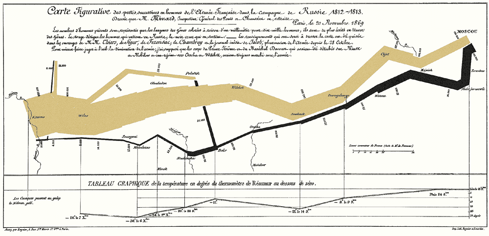
Edward Tufte's - March to Moscow
Edward Tufte's - The March to Moscow
This is often considered the best statistical graph ever drawn. The graphic depicts the fate of Napoleon’s army on its ill-fated Russian campaign during the winter of 1812-1813. The tan-colored band represents the march toward Moscow and the black-colored band represents the retreat back toward France...Brilliant in its simplicity and clarity...
Wednesday, February 13, 2013

Tuesday, February 12, 2013
Lord of the Rings - Interactives
Timeline
Whether you are a fan or not of Lord of the Rings (I confess, I am a fan), this is an amazing interactive piece. Smartly combining map locations a vertical timeline, this interactive timeline is extremely well designed and loads quickly whether by rollover or click.
http://lotrproject.com/timeline/
Map

The map also is a quick load and layers are easily displayed with a checkbox. Brilliant!
http://lotrproject.com/map/#zoom=3&lat=-1100&lon=1500&layers=BT
Monday, February 11, 2013
The Origins and Paths of Epidemics
This is a stunning map

Source: http://thumbnails.visually.netdna-cdn.com/the-origins-and-paths-of-epidemics_50290c2089090.png
Sunday, February 10, 2013
Remappng the United States by mobile calling patterns
Cellphone Calls Reveal The United States’s Invisible Ties
Remappng the United States
-- not by geography, but by analyzing mobile-phone calling patterns
This is cool!

Article >
Friday, February 8, 2013
More Music-Related Humor
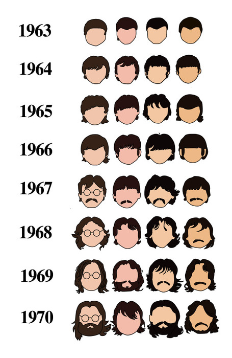
History of The Beatles as told by their hair
Music Discovery: Then and Now
Hear a new song you like ?
What Happens next... 1990 vs 2010 (Funny)

Monday, February 4, 2013
Sheet Music
Musical Notation can actually be considered an infographic. Like a map or graph, each element (staff, clef, note, articulation marking, etc.) is a symbol and combined together they make up a visualization of the musical sound.
For those of you who know music notation, these will be pretty funny...
Impossible Music
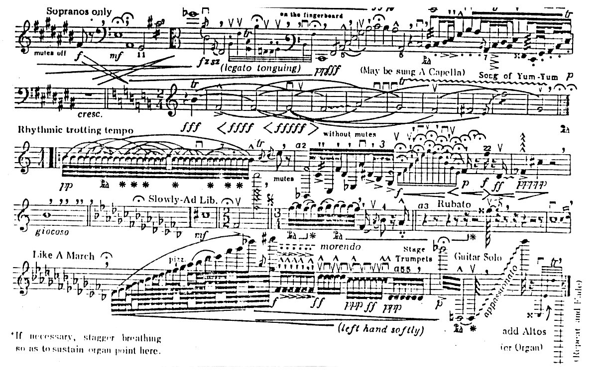
Sonata for Vuvuzela

Over The Waterfall


Subscribe to:
Posts (Atom)