Showing posts with label Migration. Show all posts

Wednesday, January 13, 2021

Best Data Visualizations of 2020

 A few selections from the visme site...

Plastic Bottles

Humans are addicted to drinking water from plastic bottles. This has turned into a huge garbage problem. This visualization shows the piles of plastic bottles in relation to famous landmarks and cityscapes. Source #5


Space Junk

Data artist Federica Fragapane was commissioned by the BBC to create a data visualization about Space Junk. The data sets are separated into different categories; the distance from the earth, the types of space junk, and the size and mass of the objects. Source #10


Migration


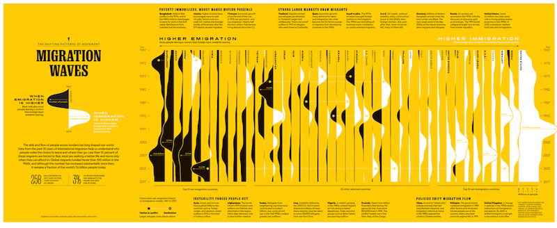
Migration waves is a visualization of data from 50 years of migration. The black and white waves over the yellow background create a wonderfully visual rendition of the data. It’s interesting to see in which countries more people leave and in which countries more people settle anew. Source  #21

Saturday, December 12, 2020

Three Great Interactive Maps

A Few Great Interactive Maps...

With technology advancements, content on maps and the maps themselves became digital, interactive, and more appealing as they’re incorporated in data analysis and reporting. Seeing location data mapped and included in visualizations has both enhanced understanding by more audiences and offered a valuable, new context.

Below are three notable data-driven examples that demonstrate the power of location data when paired with business intelligence.

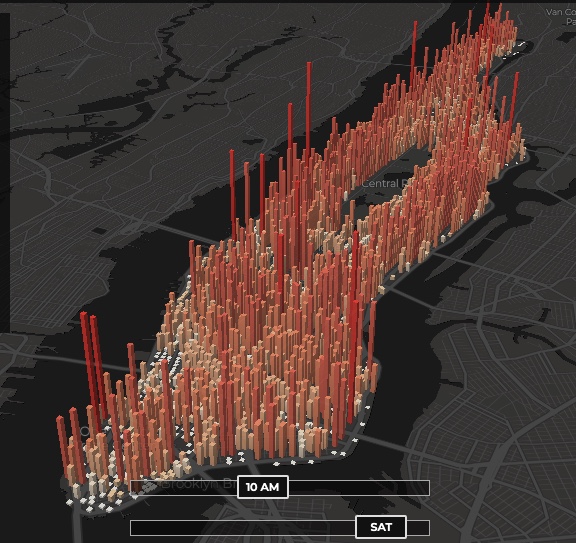
1 - The invisible heartbeat of New York City

Visualization by: Justin Fung. This is amazing (you may have to refresh the page)

http://manpopex.us/


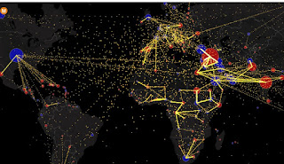
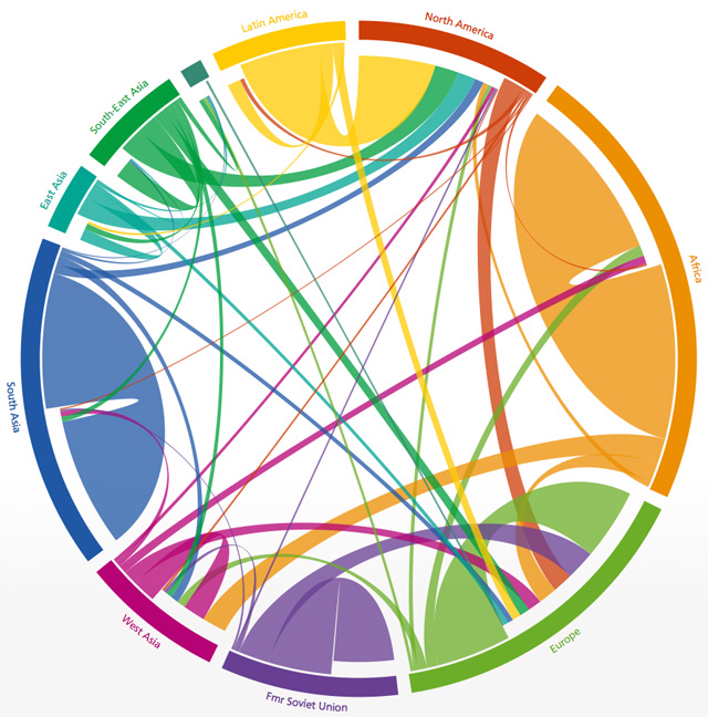
2 - All the World’s Immigration Visualized in One Map

Estimated net immigration (inflows minus outflows) by origin and destination country between 2010 and 2015.


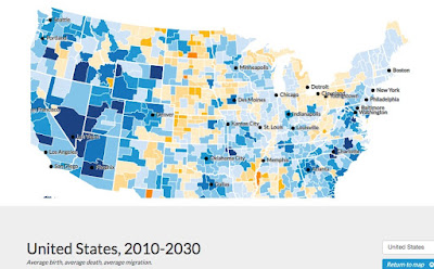
 3 - Mapping America’s Futures

This is a great example of a well made data-driven interactive map.

Test possible scenarios for how the US population might change by 2020 and 2030. The results will change depending on whether you choose low, average, or high rates for future births, deaths, or migration.

https://apps.urban.org/features/mapping-americas-futures/#map


Friday, October 16, 2015

Polynesia - Visual Quick Study

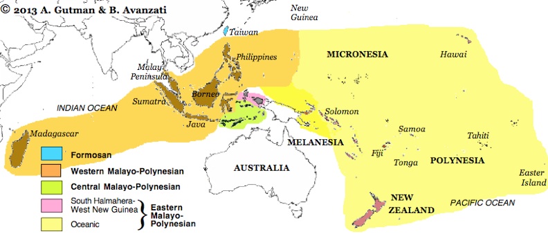
About 4,000 years ago, Austronesian speakers migrated eastward from the Asian mainland to in the area referred to as Near or Western Oceania. The subsequent expansion of these Austronesians into Eastern Oceania began around 1200 BC and led to the colonization of the islands in the eastern Pacific Ocean. This expansion ended with the settlement and colonization of New Zealand around 1250 AD.

Melanesia, Polynesia and Micronesia

Polynesian Migration Maps


Article: 
 ^This is a great site ^


Pacific Currents


Austronesian Language


Monday, February 9, 2015

Sunday, November 16, 2014

Visualizing Global Migration

Both Vintage and "Cutting Edge" Maps of Global Migration
 Global Migration circa 1858

Article >


The Global Flow of People

Five-year periods, 1990 to 2010

Tuesday, September 3, 2013

Earth Pulse - Vital Statistics


Vital Statistics 

Map and compare global trends -


Check this one out - it is pretty amazing!
Population, Resources, Deforestation, Political Migration and More...
Map and compare global trends.

Tuesday, August 6, 2013

Where 60 Million People in the U.S. Don't Speak English at Home

People Who Speak Spanish at Home

(each dot represents approximately 10 people)


The share of Americans who don't speak English at home has been rising: In 2000, these households made up 17.9 percent of the population. By 2007, it was 19.7 percent. As of the latest data, from the 2011 American Community Survey, the share is now 20.8 percent – fully one-fifth of all people living in the U.S.