A Few Great Interactive Maps...
With technology advancements, content on maps and the maps themselves became digital, interactive, and more appealing as they’re incorporated in data analysis and reporting. Seeing location data mapped and included in visualizations has both enhanced understanding by more audiences and offered a valuable, new context.
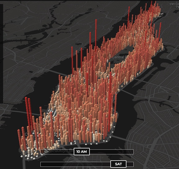
1 - The invisible heartbeat of New York City
Visualization by: Justin Fung. This is amazing (you may have to refresh the page)

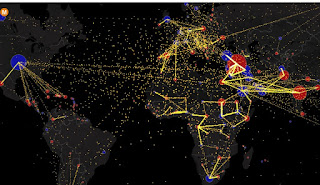
2 - All the World’s Immigration Visualized in One Map
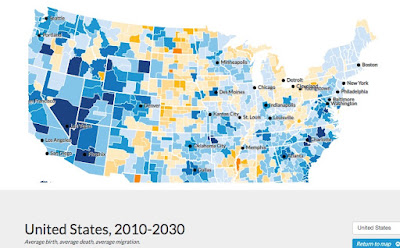
3 - Mapping America’s Futures
This is a great example of a well made data-driven interactive map.
Test possible scenarios for how the US population might change by 2020 and 2030. The results will change depending on whether you choose low, average, or high rates for future births, deaths, or migration.
https://apps.urban.org/features/mapping-americas-futures/#map
No comments:
Post a Comment