Showing posts with label Infographic Map. Show all posts

Wednesday, January 5, 2022

Mapping Deforestation

Mapped: 30 Years of Deforestation and Forest Growth, by Country

Today, forests make up around 31% of the Earth’s total land area, spanning 15.68 million square miles (40.6 million km²). Over the past three decades, the world lost a bit more than 4% (685,300 square miles) of its forests, which equates to an area about half the size of India.

Europe and Asia were the only two regions which had significant overall forest growth during this time period, while Oceania saw no significant change and North and Central America saw a slight reduction.

Africa along with South America and the Caribbean were the regions with the greatest amount of deforestation, both losing more than 15% of their forests over the past 30 years. 

Article >


Saturday, September 12, 2015

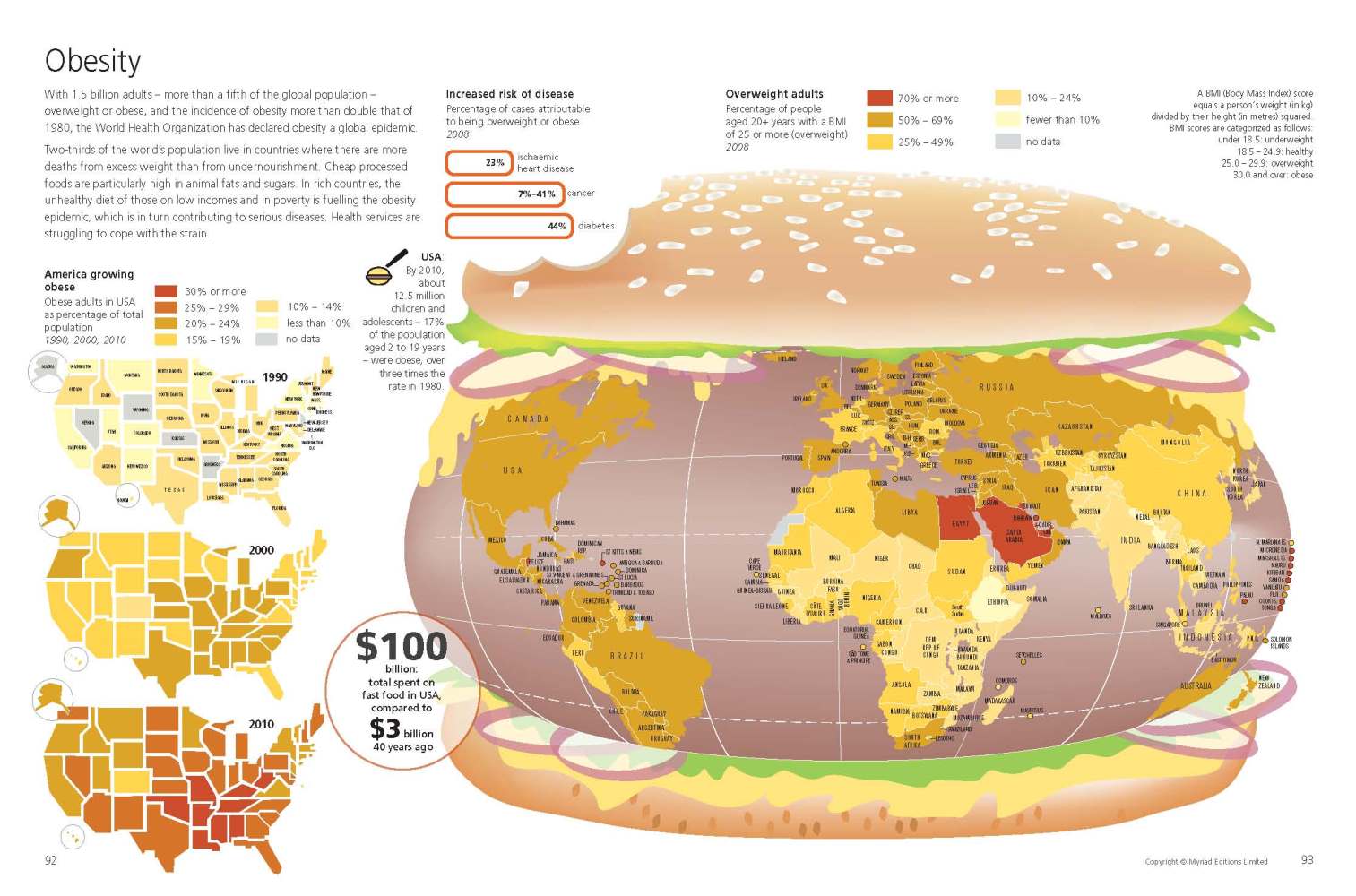
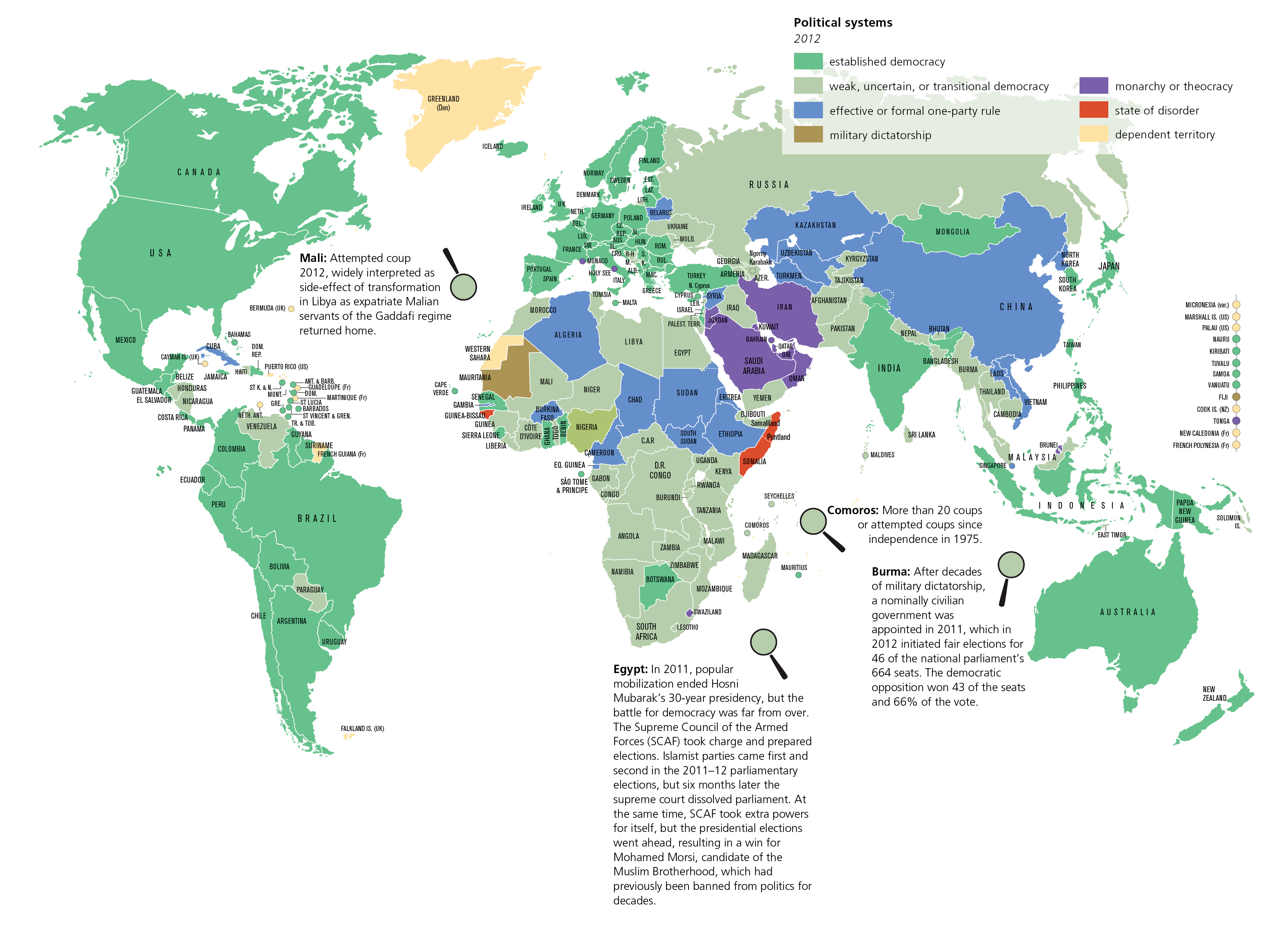
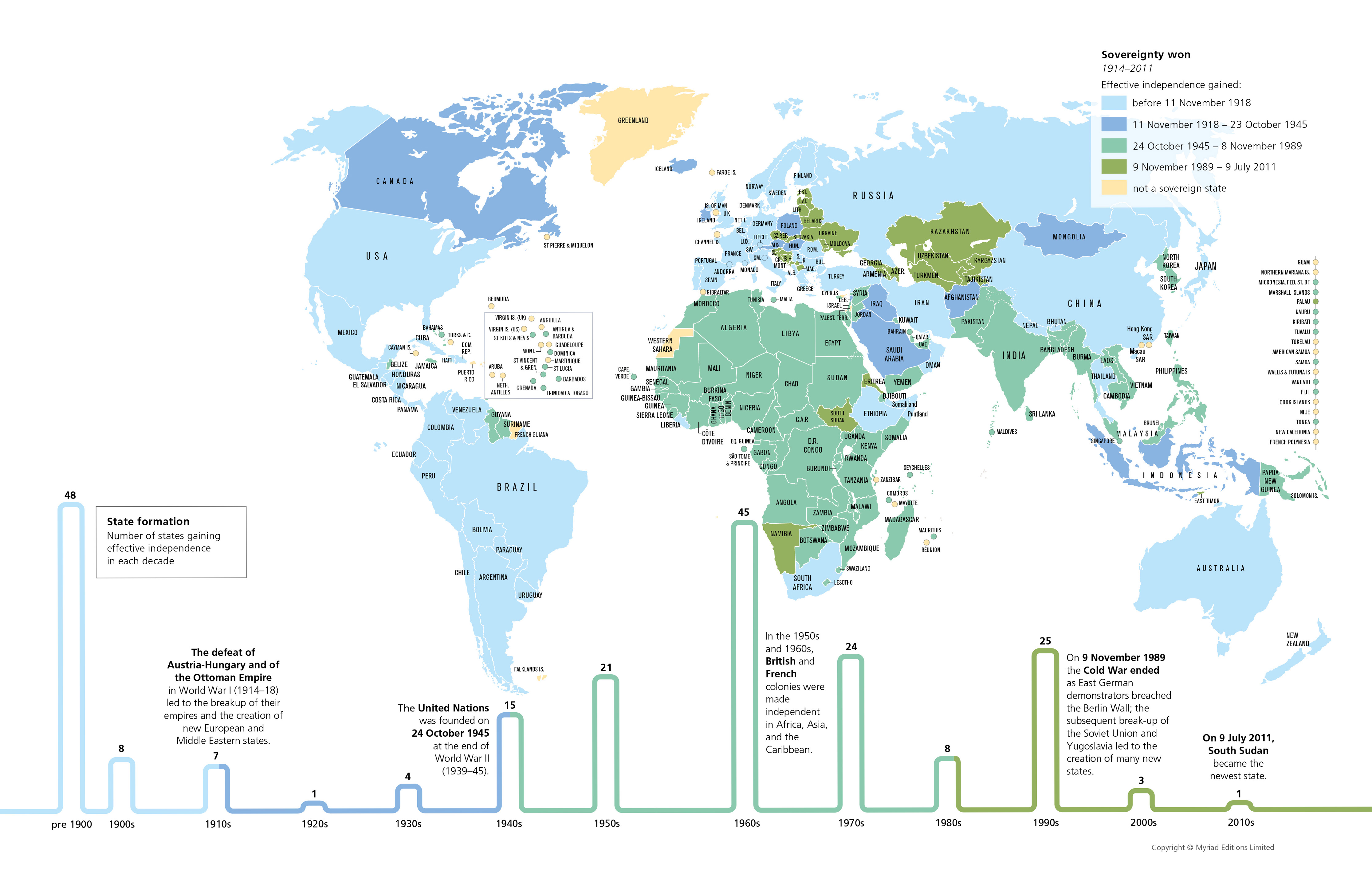
State of the World (Myriad Editions)

I took this book/atlas out of the library near where I work. Highly recommended, it is very nicely done...

The State of the World Atlas, was originally devised by Michael Kidron and Ronald Segal and is now authored by leading international peace researcher Dan Smith, OBE. It has sold more than 700,000 copies worldwide.  (Myriad Editions-  Penguin Books)

Over 50-plus thematic world maps and vivid graphics break down hardcore statistics into an accessible, compelling form. A unique visual overview of current events and global trends.
Atlas Book Cover


EXAMPLES


As used in blogs...


Friday, September 11, 2015

Mapping Stereotypes by Yanko Tsvetkov

I was actually out to compile a different set of (serious!) maps but Yanko's work caught my eye and this post came about instead - he is brilliant!

Atlas of Prejudice

Visit his gallery: https://atlasofprejudice.com/


Be sure to visit his site for more "mapped insights" on stereotypes

Mapping Stereotypes >

Infographics Blog Feature:


Tuesday, June 25, 2013

Mapping the Rise of American Craft Beer


As of March, the United States was home to nearly 
two thousand four hundred craft breweries


 Check out the interactive map based on 2012 data 
gathered by the Brewers Association, it is very nicely done!

Wednesday, May 8, 2013

The Housing + Transportation Affordability Index

This interactive map is amazing!

http://htaindex.cnt.org/map/
(A good sequel to yesterday's post...)

The Housing + Transportation Affordability Index is an innovative tool that measures the true affordability of housing based on its location.  Users can view housing and transportation data as maps, charts, and statistics for nearly 900 metropolitan and micropolitan areas—covering 89 percent of the U.S. population. 

The interactive mapping tool was designed to enable individuals, planners, and policymakers to more fully grasp and act on the relationship between development patterns, transportation behavior, and household transportation costs. 

Wednesday, April 17, 2013

Saturday, March 2, 2013

U.S. Passenger Rail Ridership


Interactive map featuring data on all Amtrak routes 


Amtrak Could Become Profitable...

Over the last 15 years, Amtrak ridership has grown 55 percent, outpacing population growth by a factor of three. It’s the fastest growing means of domestic transport, and shows no signs of slowing down. Article >

Thursday, February 14, 2013

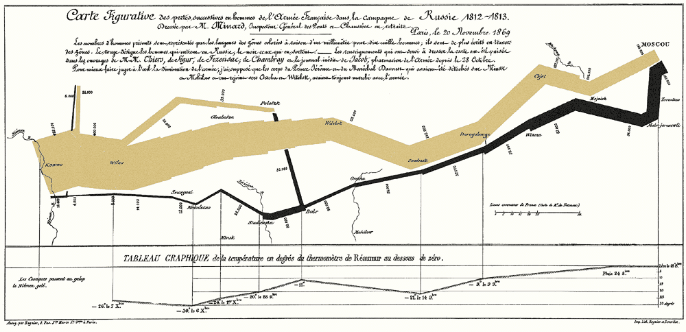
Edward Tufte's - March to Moscow


Edward Tufte's  - The March to Moscow

This is often considered the best statistical graph ever drawn.  The graphic depicts the fate of Napoleon’s army on its ill-fated Russian campaign during the winter of 1812-1813. The tan-colored band represents the march toward Moscow and the black-colored band represents the retreat back toward France...
Brilliant in its simplicity and clarity... 
Source:  http://www.edwardtufte.com/tufte/graphics/minard_lg.gif

Sunday, January 27, 2013

Travel Times in the 1800s...


How fast could you travel across the U.S. in the 1800s?

In this age of instant gratification with digital communications and fast travel, we tend to forget that not so long ago, traveling anywhere took a lot longer.

 In the 1800s, traveling a few hundred miles across the U.S. meant taking a steam-powered train, and the trip could take days.
Wonderful article and map collection

Tuesday, January 22, 2013

Twelve States of America?

The Twelve States of America


Since 1980, income inequality has fractured the nation... Great use of layered interactivity as all that info is too overwhelming on only one layer.


This map is part of a much larger project called "Our Patchwork Nation" - the link to that is on the top of the page. This project is an amazing study but due to the large amount of data- it often loads very slow...