A few selections from the visme site...
Plastic Bottles
Humans are addicted to drinking water from plastic bottles. This has turned into a huge garbage problem. This visualization shows the piles of plastic bottles in relation to famous landmarks and cityscapes. Source #5

Space Junk
Data artist Federica Fragapane was commissioned by the BBC to create a data visualization about Space Junk. The data sets are separated into different categories; the distance from the earth, the types of space junk, and the size and mass of the objects. Source #10

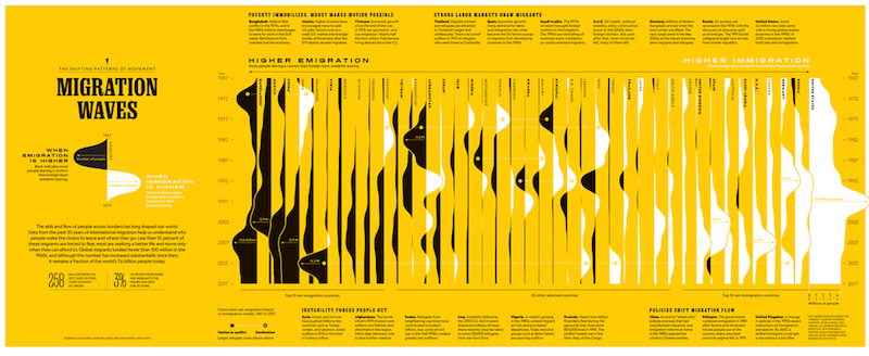
Migration
Migration waves is a visualization of data from 50 years of migration. The black and white waves over the yellow background create a wonderfully visual rendition of the data. It’s interesting to see in which countries more people leave and in which countries more people settle anew. Source #21
No comments:
Post a Comment