Thursday, January 31, 2013

Benefits of Biking

The Benefits of Biking


Bikes Make Jobs

Three Charts Show How Bikes Investment Stacks up Against Cars


The Economic Benefits of Bicycling


The economic impact of greenways:
  • Properties adjacent to a local greenway and trail valued higher than properties farther away from those trails.
  • Improve business in the surrounding areas
  • Generates a healthy lifestylye


Tuesday, January 29, 2013

Great Lakes Currents (Animated Map)


Great Lakes Surface Currents Map 
Pretty Amazing animation from data

Surface currents tend to follow the wind direction more closely than currents at depth. Depth-averaged currents represent the average water motion from surface to bottom and tend to follow shoreline and bottom contours. 


Monday, January 28, 2013

GPS Bike Mapping

QUESTION:
What makes a great infographic?  
ANSWER:
The ability to combine a lot of data (information) into to an easy to understand Visual Display. The Ride With GPS App is certainly one of the cutting edge examples of this.


The centerpiece of the display is a log of the route of your bike ride superimposed on a Google Map. Interactive layered graphs of the ride data are available below the map and the whole interface can be viewed as am animated sequence from the playback control. There is an amazing amount of data available (Elevation, Speed, Grade, Time, Place, etc.) all available by an intuitive interactive interface.

Every control is easily accessed and data views can be collapsed/expannded, zoomed, etc. on the fly. 

MOUNTAIN BIKING EXAMPLES

Sunday, January 27, 2013

Maps of Hurricane Sandy's winds

View time-lapse maps of Hurricane Sandy's winds.
click the blue Next button to view the successive images

Travel Times in the 1800s...


How fast could you travel across the U.S. in the 1800s?

In this age of instant gratification with digital communications and fast travel, we tend to forget that not so long ago, traveling anywhere took a lot longer.

 In the 1800s, traveling a few hundred miles across the U.S. meant taking a steam-powered train, and the trip could take days.
Wonderful article and map collection

A Company's Evolution Animated


The OrgOrgChart (Organic Organization Chart) project looks at the evolution of a company's structure over time. A snapshot of the Autodesk organizational hierarchy was taken each day between May 2007 and June 2011, a span of 1,498 days.

Each day the entire hierarchy of the company is constructed as a tree with each employee represented by a circle, and a line connecting each employee with his or her manager. Larger circles represent managers with more employees working under them. The tree is then laid out using a force-directed layout algorithm.


Read quick summary and scroll to video
Amazing video - totally mesmerizing... 

Saturday, January 26, 2013

Violent Deaths by Age


This is a very powerful chart...


Data on the cause of violent deaths by age (including suicide)
"In the United States, when people decide to kill people, or kill themselves, they typically reach for a gun."

http://www.washingtonpost.com/blogs/wonkblog/wp/2012/12/26/guns-kill-people-in-one-chilling-graph/

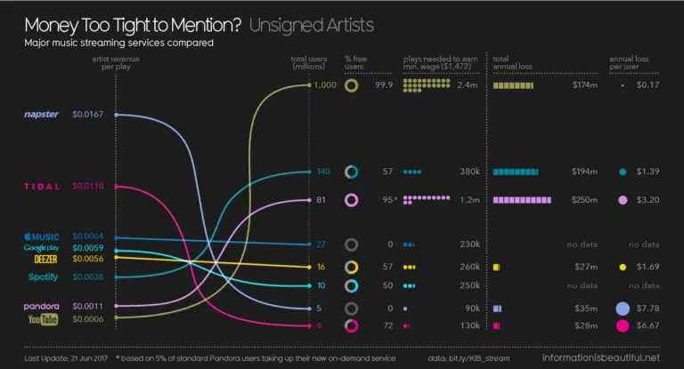
How Much Do Music Artists Earn Online?

The Online Music Business - Earning Pennies...


Streaming music sites with freely accessible content are being used by a growing number of listeners as a substitute for buying music.

The new world of music looks very different from the old. With the new Web services, listeners don't put CDs into a stereo or download tunes to their iPod. Instead, their music sits on a server somewhere else, waiting to be played from a computer or any other Net-connected device. Source: Business Week 


"According to recent data, most major label artists 
see nothing from their Spotify streams."
Excerpted from Music And_Piracy Infographic by curseofthemoon

By my calculation it would take songwriting royalties for roughly 312,000 plays on Pandora to earn us the profit of one-- one-- LP sale. (On Spotify, one LP is equivalent to 47,680 plays.) Source: Damon Krukowski

Music at your fingertips on your cell phone or tablet may be cool but these companies are bleeding the creative artist dry... "Pandora's Box has already been opened" and it's hard to "put the genie back in the bottle" but folks should be aware just how much the music bizness has devolved.


Article >


Global Carbon Emissions

Bubble Chart - Carbon Emissions

A bubble chart used for maximum effectiveness. Ina millisecond you see that China and the U.S. are the worst offenders. The color scheme easily visually delineates continents without even the need for a key.

Site > http://www.stanfordkaystudio.com/information.html
As you scrolled down, did you notice the overall shape?

This dual infographic just nails it home brilliantly.
http://www.architectsjournal.co.uk/pictures/576x432fitpad[0]/4/2/3/1291423_Untitled.jpg

Thursday, January 24, 2013

Graphic > Deconstructing a Ford plant

An historical saga all in one graphic...

What a great graphic! So much info yet it is tightly organized and easy to understand. The comparison to the Empire State Building is very simple yet powerful - the viewer immediately grasps just how huge this plant really is. The Worker Timeline red circles very simply displays at a glance the amount of workers involved at various times.

Article
http://cdn.theatlantic.com/static/coma/images/issues/200904/map-ford.jpg

Disassembly Line 
http://thesocietypages.org/graphicsociology/tag/atlantic-monthly/
(Click on Graphic to enlarge in a modal window)
All in all, a brilliant piece of work.

Tuesday, January 22, 2013

Twelve States of America?

The Twelve States of America


Since 1980, income inequality has fractured the nation... Great use of layered interactivity as all that info is too overwhelming on only one layer.


This map is part of a much larger project called "Our Patchwork Nation" - the link to that is on the top of the page. This project is an amazing study but due to the large amount of data- it often loads very slow...

Monday, January 21, 2013

data > information > knowledge > wisdom?

The Hierarchy of Visual Understanding


Does increasing organization increase 
meaning and memory retention?


This interesting pyramid chart is is more of a philosophical "thought piece" but is nonetheless an insightful take on the relationship of data, information, knowledge and wisdom.


From the comments on this (at the URL above) 
  • Noise becomes data when it has a cognitive pattern. 
  • Data becomes information when assembled into a coherent whole, which can be related to other information 
  • Information becomes knowledge when integrated with other information in a form useful for making decisions and determining actions. 
  • Knowledge becomes understanding when related to other knowledge in a manner useful in anticipating, judging and acting. 
  • Understanding becomes wisdom when informed by purpose, ethics, principles, memory and projection.
– George Santayana

Info Overload?


Americans Consume 34 GBs of Data Daily


http://mashable.com/2009/12/09/american-data-diet/https://mashable.com/2009/12/09/american-data-diet/


"In all, we spend about 11.8 hours per day absorbing mass quantities of information, sometimes multitasking in front of multiple screens simultaneously."
Although posted in 2009, the subject is interesting and a good reference point for understanding the information explosion. The pie chart in the article nicely illustrates the breakdown of "electronic diversions" yet the text has numerical data that could benefit by being visualized as well. 

This simple graphic found elsewhere--through a comparison--helps conceptualize just how huge 34 GBs is... http://www.npr.org/news/graphics/2011/11/big-data/gr-25gb-300.gif

and this graph (although very subjective) helps visualize the concept better
http://farm2.static.flickr.com/1069/5099479638_162426816b.jpg


Sunday, January 20, 2013

The Information Explosion (Welcome To My Blog)

Welcome

This blog will highlight great infographics available online and discuss both the short and long term aspects of the information explosion.


The Information Explosion

The amount of information that we absorb is often on overload. Did you know that between the birth of the world and 2003, there were five exabytes of information created. "We now create five exabytes every two days (Google CEO Eric Schmidt)."


With the rise of the Internet, electronic books, blogs and mobile devices, we’ve never had easier access to an unimaginably vast avalanche of digital information that is increasing exponentially as we speak.

One way to help process this horde of data is through infographics. A good infographic is simple way to visually present info that might otherwise be misunderstood or avoided because it seems too complex. Using symbols, charts and maps; graphic visual representations of data can help us process information quickly and clearly.

Once used predominantly to make maps more approachable, scientific charts less daunting and as key learning tools for children, inforgraphics have now permeated all aspects of our modern world.

What is an Infographic?

Here is a perfect example (an Infographic defining Infographics!)
http://visual.ly/what-infographic-2


"A picture is worth a thousand words" a common and easily understood phrase that means a complex idea can be conveyed with just a single still image. It also aptly characterizes one of the main goals of visualization, namely making it possible to absorb large amounts of data quickly.